


 Guide
Guide BoxPrint Guides
From design to press: preparing print-ready artwork correctly
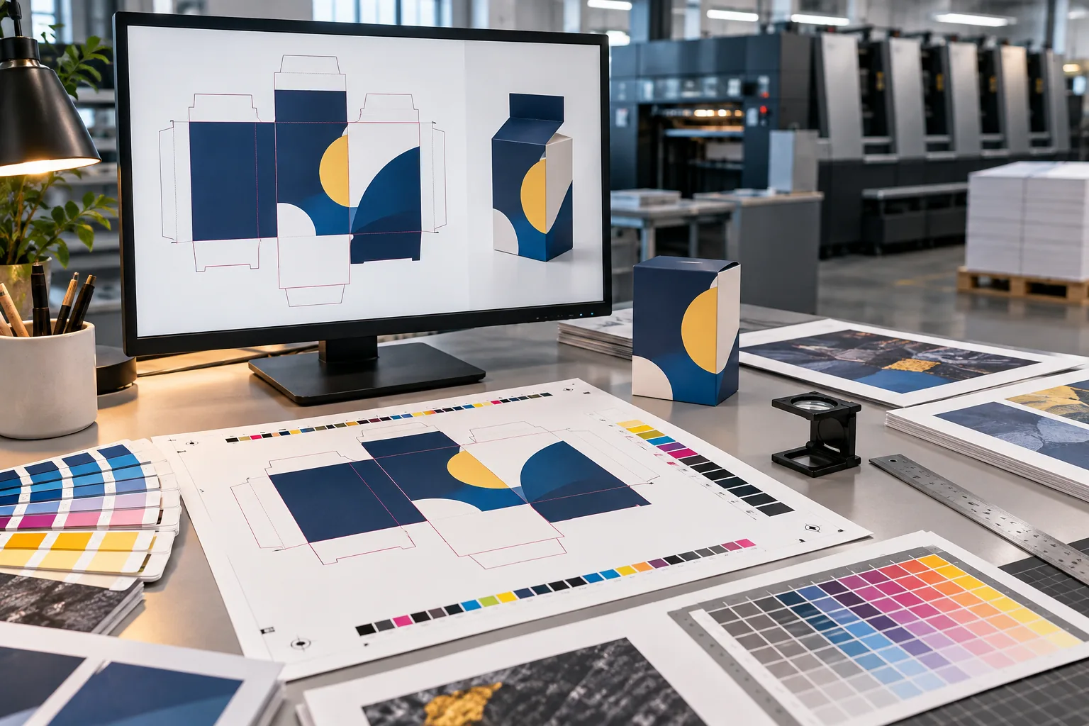
Artwork that looks polished on screen is not automatically ready for production. Prepress turns a design into precise manufacturing instructions: where the sheet is cut, where the box folds, and which graphics must extend beyond the trim.
Build on the approved dieline
Packaging artwork should be created on the final cutting and folding template. Avoid changing the template after design approval, and keep important content away from folds, glue areas and trim edges.
- Keep cut and fold guides on a clear non-printing layer.
- Maintain a safe area for copy and logos.
- Extend backgrounds and images into the bleed defined for the job.
Screen colour and print colour are different
Screens display RGB light, while most commercial print workflows use CMYK or agreed spot colours. Prepare colour for the selected process and review important tones through an approved proof rather than relying on an uncalibrated display.
Important: if a brand colour must be matched closely, share its colour reference early and agree the appropriate proof before production.Check images and fonts
Use high-resolution images at their intended print size and avoid enlarging small files inside the layout. Embed fonts or convert final copy to outlines when requested by prepress, while keeping an editable source file in your archive.
Preflight checklist
- The dimensions and dieline match the approved specification.
- Bleed and safe areas are present on every edge.
- Colours and images suit the intended printing method.
- Fonts, links and placed artwork are packaged correctly.
- Barcodes, copy and numbers have been reviewed on the final proof.
- A print-ready PDF and an editable working file have both been retained.
An organised file reduces avoidable revision rounds and makes the proof clearer for everyone before production begins.
Browse guides

Questions this guide answers
Editorial examples of what this guide covers — not comments left by users.

Why do colours look different on screen and in print?
Screens display RGB light, while most commercial print uses CMYK or agreed spot colours, so important tones are checked on an approved proof.

What is bleed and why do I need it?
Bleed is the background and imagery extended beyond the trim line, so no white edge appears after cutting.

Should I convert fonts to outlines?
Embed fonts or convert final copy to outlines when prepress asks for it, and keep an editable source file for yourself.